mcp.sentry.dev
Triaging Sentry issues is a deceptively hard problem. When you open the dashboard and see around 400 unresolved events spread across a dozen issues, the instinct is to start with the one that looks scariest. But “looks scariest” is not a strategy. It’s a feeling, and feelings don’t scale.
In this post I’ll walk through how I used the Sentry MCP (Model Context Protocol) integration with a structured, data-driven scoring framework to identify, rank, and fix the four highest-impact issues in our production systems, cutting the daily event volume from ~400 to a projected 20-40 events (90-96% reduction).
I’ll share in this post my personal experience on a real case. The specific numbers and details are anonymized, but the process and framework are exactly what I used. You can apply the same approach to your Sentry data today.
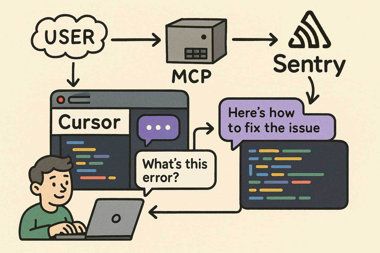
MCP (Model Context Protocol) is an open standard that lets AI assistants call external tools and APIs. Sentry ships an MCP server that exposes your Sentry data (issues, events, metadata) directly to your AI coding assistant.
In practice, that means instead of manually opening the Sentry dashboard, copying issue IDs, reading stack traces, and cross-referencing them with your code, you can do all of that inside your editor with natural language.
The tools I used in this analysis was the following Sentry MCP endpoints (I didn’t have to call all of these manually; the agent do it for me based on the prompt instructions):
mcp_sentry_search_issues: ranked unresolved issues by event frequencymcp_sentry_search_events: aggregated error types, counts, and timestampsmcp_sentry_search_issue_events: inspected individual events for geo, browser, OS, and user agent metadatamcp_sentry_whoami: verified authentication contextThe query I ran to start (same here, I customized it in the prompt):
Query:         is:unresolved lastSeen:-24h
Sort:          freq (by event frequency)
Time range:    24-hour production window
Limit:         Top 10 unresolved issues
This gave me a ranked list of production issues sorted by how often they were firing. From there, the real work began: deciding which ones to actually fix.
A naive approach would be to sort by frequency and start from the top. That would give me the right answer most of the time, but it misses important nuance:
Frequency matters. But frequency alone is not enough.
I evaluated each of the top 10 issues using a 5-factor weighted scoring matrix:
Score = (Frequency × 0.40) + (Severity × 0.25) + (Complexity × 0.20) + (UserImpact × 0.10) + (BlastRadius × 0.05)Each factor is scored 0–10. Let me explain why each weight is what it is.
This is the biggest lever because high-volume events create a feedback loop problem: when 215 events a day are noise, you can’t see the 68 real errors hiding behind them. Fixing the noise first is not about ignoring real problems; it’s about making real problems visible.
Higher frequency also means faster validation. If a fix works, the daily count drops within hours. There’s no ambiguity.
Why not higher, like 50%?
Because then a massive CSS warning would always beat a low-frequency critical blocker. Frequency needs to be balanced with “does it actually matter?”
A blocking error outranks a warning, but not by a factor of 10. A warning firing 215 times a day creates more operational friction than a critical error firing 14 times a day, because at that volume you stop seeing everything else.
The scale I used:
A 7-line guard condition and a 200-line architectural refactor are not the same decision. Lower complexity means:
All four issues I selected were under 30 lines of change. That’s not a coincidence: I explicitly scored low-complexity fixes higher because in sprint-based work, “done safely now” beats “perfect eventually.”
Why not lower, like 5%?
Because implementation risk is real. A complex fix touching shared core modules can introduce new issues worse than the one you’re fixing. Complexity should always be in the calculus.
Geographic spread, user count, and affected user roles. This is deliberately low because volume already captures some of this. An issue affecting multiple regions tends to have more events than one affecting a single location.
The goal is to use this as a refinement signal, not a primary driver. Double-penalizing for multi-region volume would distort the ranking.
How many files does the fix touch? Does it affect a shared core module or an isolated hook? This is a tie-breaker for issues with similar scores. It reinforces the “safe, isolated change” preference without overriding anything else.
Here’s what the actual numbers looked like for the four issues I selected:
| Issue | Frequency | Severity | Complexity | UserImpact | BlastRadius | Score | Rank |
|---|---|---|---|---|---|---|---|
| Issue A (215 events, warning noise) | 9.5 | 3.0 | 9.5 | 7.0 | 8.0 | 7.42 | 🥇 1st |
| Issue B (68 events, geometry error) | 5.5 | 9.0 | 5.0 | 9.0 | 6.0 | 6.65 | 🥈 2nd |
| Issue C (61 events, sort crash) | 5.0 | 9.0 | 8.0 | 5.0 | 8.0 | 6.35 | 🥉 3rd |
| Issue D (14 events, lifecycle crash) | 1.5 | 9.0 | 8.0 | 3.0 | 7.0 | 4.95 | 4th |
The most interesting result: Issue A is ranked #1 despite being “just” a warning.
Let me justify that.
Issue A was a Sentry warning, not an error. It had zero functional impact on users. Maps rendered fine, navigation worked, nothing was blocked.
But it was firing 215 times a day across multiple regions. That single issue represented ~40% of total production Sentry volume.
When your dashboard is ~40% noise, you’re effectively operating blind. You start ignoring things. You miss the next critical issue because it looks like another spike in a noisy feed. And, also, we pay Sentry. The warning wasn’t a user problem; it was a monitoring problem.
Fixing it first was the right call because:
if (!storeId || storeId === 'undefined') return). No behavioral change for valid states.This is the core insight behind prioritizing noise over real errors in phase 1: noise reduction is a prerequisite for accurate triage.
Before committing to this framework, I tested it against extreme cases to make sure the scores made intuitive sense.
Test Case A: Massive CSS warning (trivial fix)
500 events of a pure CSS console warning, 1-line fix
Score = (10 × 0.40) + (2 × 0.25) + (9 × 0.20) + (8 × 0.10) + (9 × 0.05)
      = 4.0 + 0.5 + 1.8 + 0.8 + 0.45 = 7.55 ✅ HIGH
Expected: Fix it immediately. It’s destroying signal. ✅
Test Case B: Rare critical blocker (large refactor)
2 events of a full workflow crash, 50-line refactor required
Score = (2 × 0.40) + (10 × 0.25) + (3 × 0.20) + (3 × 0.10) + (3 × 0.05)
      = 0.8 + 2.5 + 0.6 + 0.3 + 0.15 = 4.35 ✅ LOW
Expected: Phase 2. It’s serious but rare, and the fix carries risk. ✅
The extreme cases produced sensible results. The framework wasn’t optimizing for the wrong thing.
If I had used severity-first (90% weight):
Issue D (14 events, lifecycle crash) would rank #1. But 14 events in 24 hours is a manageable edge case. Fixing it while 215 events of noise pile up every day would be the wrong order, and the dashboard stays broken.
If I had used frequency-only (100% weight):
Everything in the right order, but no distinction between “warning” and “error.” A CSS warning with 100 events would rank identically to a user-blocking crash with 100 events. That’s not useful.
The hybrid approach wins because it captures all the dimensions that matter operationally: how often, how bad, how safe to fix, how many users, how isolated.
After running the Sentry MCP queries, here’s the event volume breakdown across the top issues:
Issue A: ████████████████████████████████████████  215 events  (40%)
Issue B: █████████████                              68 events  (13%)
Issue C: ███████████                                61 events  (11%)
Issue D: ███                                        14 events   (3%)
───────────────────────────────────────────────────────────────────
Total:                                   358 events  (95% of volume)
These four issues accounted for 95% of all unresolved production event volume in a 24-hour window. The remaining 5% were isolated one-off events that didn’t meet the selection criteria.
The temporal patterns were also telling:
One thing that convinced me to prioritize this work: projecting the 24-hour baseline forward.
| Issue | 24h Events | 7-day Projection | 30-day Projection |
|---|---|---|---|
| Issue A | 215 | ~1,505 | ~6,450 |
| Issue B | 68 | ~476 | ~2,040 |
| Issue C | 61 | ~427 | ~1,830 |
| Issue D | 14 | ~98 | ~420 |
| TOTAL | 358 | ~2,506 | ~10,740 |
~10,740 noise events per month if left unaddressed. Every one of those is an alert that could be hiding something real.
Post-fix projection (90–96% reduction): 15–35 events/day, down from 358.
A scoring framework is only useful if you can validate it worked. I set up simple thresholds to check after deployment:
| Issue | Current | Target | Acceptable Floor |
|---|---|---|---|
| Issue A | 215/day | <20/day | <35/day |
| Issue B | 68/day | <8/day | <12/day |
| Issue C | 61/day | <6/day | <10/day |
| Issue D | 14/day | 0/day | 2/day |
If any issue stays above the acceptable floor after 48 hours, the fix is incomplete or the root cause was misidentified.
If you have the Sentry MCP configured in your AI assistant, here’s the prompt I used (and refined) to run this entire analysis. Paste it as-is and it will collect the data, apply the scoring formula, and give you a ranked action plan.
You are a Sentry triage assistant with access to the Sentry MCP tools.

Step 1 — Collect data
Run mcp_sentry_search_issues with query "is:unresolved lastSeen:-24h", sorted by "freq", limit 15. List all results with: issue ID, title, event count, and last seen.

Step 2 — Deep-dive the top candidates

For the top 5 issues by event count, call mcp_sentry_search_issue_events on each.
Collect: error type, affected countries, browser/OS breakdown, and the most recent stack trace summary.

Step 3 — Score each issue with this formula:
  Score = (Frequency × 0.40) + (Severity × 0.25) + (Complexity × 0.20)
        + (UserImpact × 0.10) + (BlastRadius × 0.05)

Scoring guide (0–10 each):
  - Frequency:   normalize against highest event count in the batch.
                 Highest count = 10. Scale linearly.
  - Severity:    9 = error that blocks user workflow
                 5 = degraded experience (partial failure)
                 3 = warning / internal telemetry only
  - Complexity:  10 = 1–5 line guard/check, no behavior change
                  5 = medium refactor, isolated file
                  1 = architectural change, touches shared core
  - UserImpact:  10 = affects all users across all regions
                  5 = affects subset of users or 1–2 regions
                  1 = affects internal tooling or edge-case flow
  - BlastRadius: 10 = single isolated file
                  5 = shared hook or utility
                  1 = shared core module or base class

Step 4 — Produce a ranked table
Columns: Issue ID | Title | Events | Frequency | Severity | Complexity
       | UserImpact | BlastRadius | Final Score | Rank

Step 5 — For the top 3 ranked issues, provide:
  - Root cause hypothesis (based on stack trace)
  - Specific code fix recommendation (pseudocode or real code)
  - Risk assessment: what could go wrong with this fix?
  - Validation metric: what to monitor in Sentry after deployment

Step 6 — Excluded issues

List any issues from the top 10 that were NOT selected for the top 5 analysis, and explain why each was excluded (e.g., too complex to fix safely, external dependency, already tracked in a separate ticket, insufficient data).
A few things worth customizing for your context:
lastSeen:-24h) to -7d or -30d if you want trend data rather than a daily snapshot.project:your-project environment:production).The prompt is designed to be deterministic: given the same Sentry data, two runs should produce the same ranking. That’s the point of the formula.
On using Sentry MCP:
In my experience, the value isn’t just speed. It’s the ability to combine issue metadata (frequency, geo, browser), stack traces, and code inspection in a single workflow. You stop context-switching between Sentry, GitHub, and your editor.
On the scoring framework:
The weights aren’t magic numbers. They reflect operational priorities: volume matters more than severity because noise makes severity invisible. Complexity matters because safe deployment is a real constraint in production systems.
What I usually do when starting a new triage cycle: sort by frequency first to get the data, then apply the scoring matrix to reorder. Rarely will the top-frequency issue not be the right first fix, but “rarely” is not “never,” and the 3 times I’ve been wrong using pure frequency have been expensive.
On noise vs. errors:
Fixing noise before fixing errors is counterintuitive. It feels like you’re ignoring real problems. But if your dashboard is 40% noise, you’re already operating on a degraded signal. Phase 1 is about regaining visibility. Phase 2 is about using that visibility to fix real things.
Using the Sentry MCP turned a 2-hour manual triage process into a 20-minute automated analysis. The scoring framework turned “gut feeling about what to fix first” into a defensible, reproducible decision.
The result on the real case: 4 PRs, ~61 total lines of change, projected 90-96% reduction in daily Sentry volume.

This article, images or code examples may have been refined, modified, reviewed, or initially created using Generative AI with the help of LM Studio, Ollama and local models.